8 UI & UX Design Tips for Dynamic Dashboards
Dashboard is perhaps the most important element for aggregating information for users. It is the first interface that all users interact with. For an enterprise software, it is very important to create dynamic dashboards that maximise efficiency of users. The user experience, the way data is presented and ease with which key insights are delivered by the software can create a huge difference to the productivity of its users.
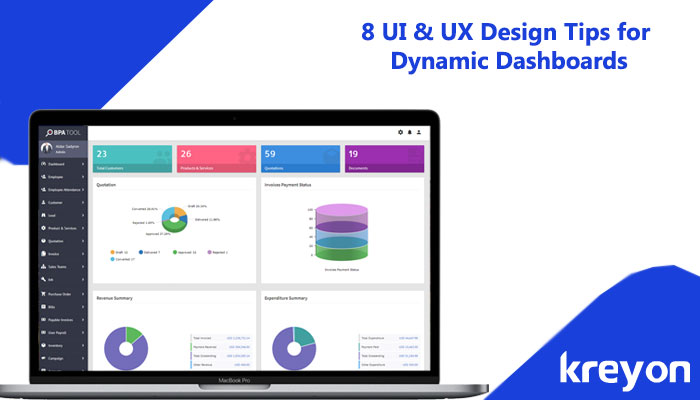
What is a dynamic dashboard? A dynamic dashboard rearranges itself according to the changing data patterns in the system. It presents the most relevant information to its users. For e.g. if there is a high priority proposal for approval, then it highlights it for the user to take the required action.
A dynamic dashboard provides an overview of the most important information at a glance. The dashboard provides an easy way to navigate directly to various areas of the application that require users attention.
The essential features of a dynamic dashboard are as follows:
- A dynamic dashboard shows useful information in a nutshell. A user can act upon this information, the visual representation of data makes things easy to understand.
- An effective dashboard is able to help its users comprehend, analyze, organise work as well as provides key insights for taking action.
- The dynamic dashboard changes according to the context of the users, role types and also highlights most relevant information to the users.
- A dynamic dashboard places all information for improving users productivity, efficiency and improves teamwork.
In this post, we discuss UI & UX design tips for building effective dynamic dashboards:
1. Organized Information
A dashboard needs to organise information. The design of the dashboard must map the data, graphs and key action items according to the role type of the users. The information is presented in terms of the importance of information to the users. For e.g. key alerts from managers, pending important activities or action items are highlighted.
The information is organised so that key elements stand out, visible clearly and quickly. The design layouts should make drilling down information seamless for the users.
2. Consistency
The dashboard information should be consistent across devices, platforms and screen sizes. The consistency means that the important information should be available to the user irrespective of which screen they are using.
The look and feel of the dashboard are also integral to its functioning. The generic color conventions should be adhered to, the fonts, placement of charts, information grids, navigation etc should be carefully planned. For e.g. red means bad, green means on target, highlighted color for something that needs attention etc.
3. User Mapping & Visualization
Who will use the dashboards? What will the main purpose of the dashboard? Which information elements must stand out? How and which devices will be used for accessing information? Any cultural considerations for designs? What will make your users successful?
Answering these questions will ensure you understand the key needs of your users and can design things according to them.
The font style, size and visual hierarchy of the information can be decided based on the user demographics. The visual presentation should make things visible according to its importance. This can be achieved by placing the key information in the larger fonts and even with different colors and less important things in relatively smaller font size.
4. Timeframe
The usefulness of information is dependent on time factor. The dashboard should consider consistent time frames. For e.g. the information on the dashboard could be displayed weekly, monthly or quarterly depending on the business case.
A consistent time convention can make life easier for the users. The historical data and information can also be accessed with more options. Clear time labelling of information, charts and data makes a dashboard readable. Clarity on dates and time periods serves utilitarian purpose on the dashboard.
5. Iconography
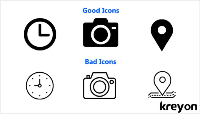
Iconography
Icons are very handy components of the dashboard, they add significance & highlight important information. Icons can be used to indicate action required from the users too.
The icons can be used alongside information, for e.g. a red clock icon can be used to display delay of a task. An icon can be used for better visualisation of data, it should be simple, symmetric, meaningful and work consistently on all devices. Using familiar icons reduce the processing time to summarise data and deliver betters readability.
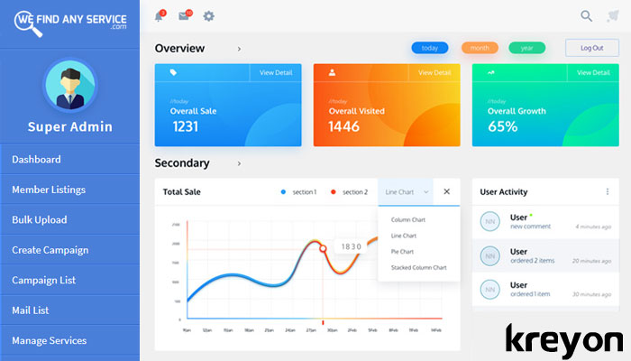
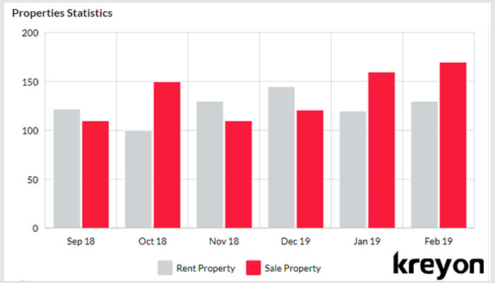
6. Simple Charts
The data can be represented with clarity using simple charts, graphs, pie graphs etc. These charts can represent information, sort the data and provide a visual comparison too. Fancy representation of the data can clutter and complicate things.
Data can be sorted as per business needs using charts and graphs. For e.g. a sales manager can have monthly closing figures of his sales team, sorted by revenue. Use clear and crisp representation on your charts. For e.g. don’t add big labels that take away the look & feel of the graphs.
The charts can be used to display the Key performance indicators, according to the roles of the users.
7. Inverted Pyramid: Information Layout
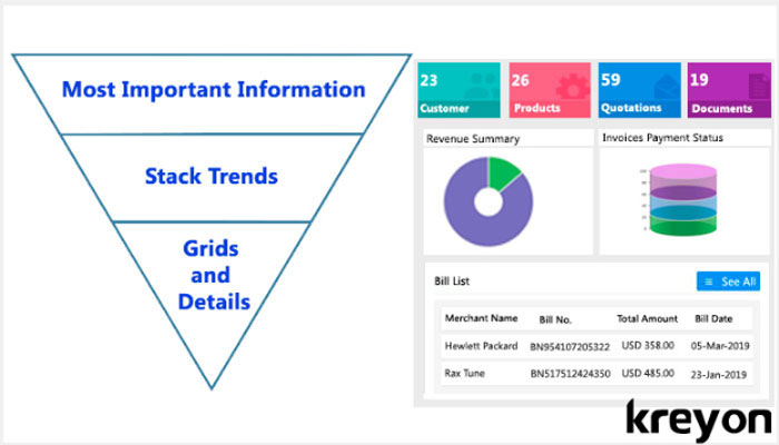
Business applications are created to save time, increase efficiency and help users accomplish their tasks. The general rule of thumb is that you display the most important information at the top, stack trends in the middle and display grids and details at the bottom of the dashboard.
The inverted pyramid is a metaphor used by writers and journalists to illustrate how information should be prioritized and structured in a report. It places the most important information at the top.
The key data patterns, analytics and display grids shouldn’t take more than a glance to capture the important elements. The inverted pyramid layout helps designers to achieve that.
8. Interactive & Dynamic
Dashboards represent a sea of information, very often they integrate various data sources and provide a holistic view of organisational data. The data is dynamic and changing rapidly. The priorities in business also change frequently.
A dashboard should have the dynamism to capture the essence of the business functions it addresses. It should aggregate information, key metrics and graphs etc into a single page.
Dashboards elements like grids, tables, graphs etc. can also have filters, sorting features for the users to interact with the data. The users can also customise information according to their needs to reorder and rearrange information according to their dynamic business needs.
Conclusion
Data dashboards for business applications and enterprise software products can make a huge difference. The way the application interacts with its users through its dynamic dashboards can improve the day to day lives of its users.
If you want to discuss your enterprise software product design, you may get in touch with us.