
AI Sales Dashboard: 12 KPIs Every CEO Should See Every Monday
Monday morning has a peculiar way of exposing the truth.
The coffee is fresh. The inbox is full. The leadership team is ready for the week. And then someone asks the question every CEO eventually learns to dread:
“How are sales looking?”
If the answer requires opening six spreadsheets, calling the VP of Sales, checking the CRM, and waiting for someone to reconcile last week’s numbers, you don’t have a dashboard. You have a scavenger hunt.
An AI sales dashboard should do something very different. It should give a CEO a concise view of where revenue stands, what is likely to happen next. Most importantly, where management attention is required.
That distinction matters. Modern sales platforms already bring together pipeline, forecasting, win rates, deal size and sales-cycle information.
Salesforce, for example, describes revenue-intelligence dashboards that combine pipeline, forecast and representative performance, while its sales-stage analysis identifies conversion bottlenecks and at-risk opportunities.
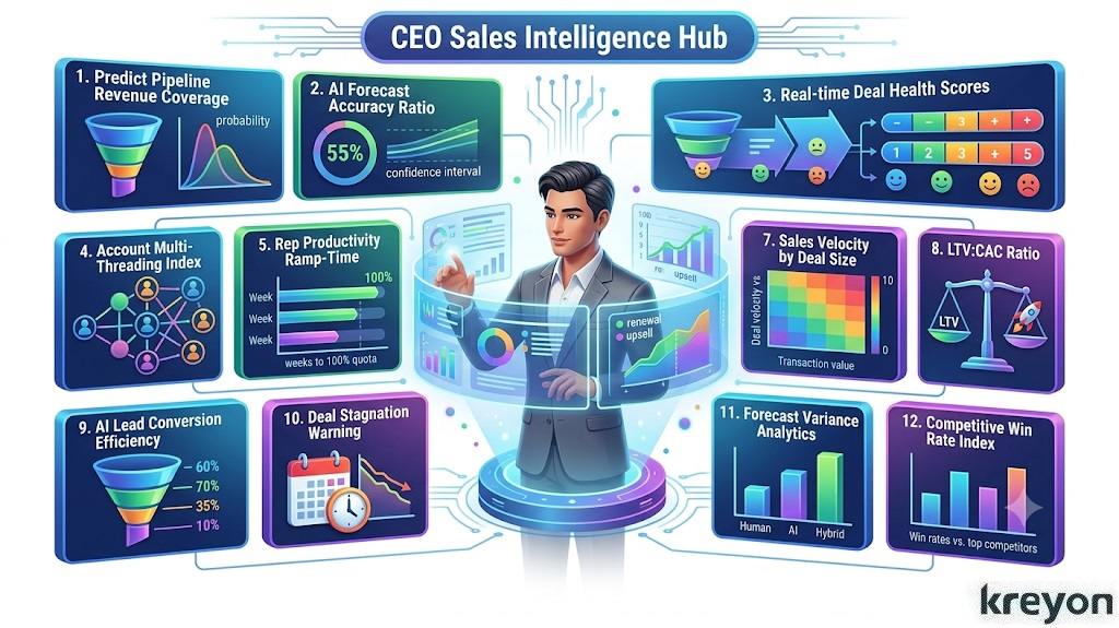
The CEO version should be even simpler. Here are the 12 KPIs an AI sales dashboard should put in front of you every Monday.
1. Revenue vs. Target
Start with the number that ultimately pays for everything else.
Show:
Revenue booked this month and quarter
Target
Percentage achieved
Variance to target
Year-over-year growth
The important question isn’t simply, “Did we grow?”
It is:
“Are we growing fast enough to hit the number we committed to?”
An AI sales dashboard can add context by comparing current performance with historical seasonality, current pipeline and expected conversion.
That turns a static revenue number into a management signal.
2. Forecasted Revenue
Booked revenue tells you where you’ve been.
Forecasted revenue tells you where you’re going.
A useful CEO dashboard should show at least three views:
Commit
Best case
Expected/AI-assisted forecast
Forecast accuracy deserves its own attention. HubSpot, for example, provides forecast-accuracy tracking specifically to help sales leaders understand how reliable their forecasts are and where the forecasting process needs improvement.
The AI layer should answer the question behind the number:
“What changed since last Monday?”
If forecasted revenue falls by 12%, the dashboard should identify the deals, stages, regions or segments responsible.
3. Pipeline Coverage
Pipeline coverage answers a deceptively simple question:
Do we have enough opportunities to hit the target?
The basic formula is:
Pipeline Coverage = Qualified Pipeline ÷ Revenue Target
For example, $3 million of qualified pipeline against a $1 million target gives 3× coverage.
There is no universal coverage ratio that works for every business. Conversion rates, deal size, sales-cycle length and pipeline quality all matter. HubSpot notes that many sales organizations operate around 3×–5× coverage, but the appropriate benchmark should be based on the company’s own historical conversion economics.
That is where an AI sales dashboard becomes useful: it can distinguish pipeline volume from pipeline quality.
A $10 million pipeline full of stalled opportunities is not necessarily healthier than a $4 million pipeline with strong, late-stage opportunities.
4. Win Rate
Win rate is one of the most familiar sales KPIs, and one of the easiest to misuse.
Track it by:
Overall company
Sales representative
Product
Industry
Customer segment
Acquisition channel
Sales stage
Salesforce defines win rate as closed-won opportunities divided by closed opportunities, including both wins and losses. The trend is often more informative than the absolute number.
If win rate drops from 32% to 24%, ask why.
Is pricing changing? Are competitors becoming more aggressive? Are leads deteriorating? Has the ICP changed? Are deals being qualified too loosely?
The dashboard should help you investigate rather than simply display red and green numbers.
5. Average Deal Size
Revenue growth can come from more customers, larger customers, or both.
Average deal size tells you which economic engine is moving.
Track:
Average Deal Size = Total Closed-Won Revenue ÷ Number of Closed-Won Deals
Then segment it.
Averages can hide important shifts. A company might maintain a $50,000 average deal while quietly losing its enterprise segment and replacing it with smaller customers.
That is why the CEO dashboard should show deal-size distribution and trends, not just one headline number.
6. Sales Cycle Length
How long does it take to turn an opportunity into revenue?
This is where many growth problems become visible before they appear in the P&L.
Track:
Average days to close
Median days to close
Days in each stage
Change versus previous quarter
Cycle length by segment
Sales-performance reporting includes average days to close and stage-level analysis, allowing leaders to see where opportunities spend the most time.
If enterprise deals are taking 30% longer to close, the CEO should know on Monday,not at the end of the quarter.
7. Pipeline Velocity
Pipeline velocity combines several dimensions of sales performance into one useful question:
How quickly is qualified pipeline turning into revenue?
A common formulation considers:
Number of opportunities × Average deal value × Win rate ÷ Sales-cycle length
Velocity can reveal a problem that pipeline coverage alone misses.
Imagine pipeline is up 40%, but sales-cycle length has doubled.
The company may look healthier on a traditional dashboard while becoming less efficient underneath.
An AI sales dashboard should flag that divergence automatically.
8. New Qualified Opportunities
Revenue is a lagging indicator.
New qualified opportunities are one of the earliest indicators of future revenue.
Track:
New qualified opportunities this week
Opportunity value
Source
ICP fit
Conversion to sales-qualified opportunity
Conversion to closed won
This is where marketing and sales finally meet on the same page.
Acquisition reporting similarly tracks accepted leads, conversion rates, touches and time to conversion.
For CEOs, the key is not simply “How many leads did marketing generate?”
It is:
“How much credible future revenue entered the system this week?”
9. Customer Acquisition Cost
Growth without economic discipline can become an expensive hobby.
CAC measures the cost of acquiring a customer and should be examined alongside customer value, gross margin and payback period.
The CEO dashboard should allow CAC to be viewed by:
Channel
Segment
Geography
Product
Customer type
A rising CAC isn’t automatically bad. A company may deliberately spend more to acquire larger customers.
The question is whether the economics justify the investment.
10. Expansion, Retention and Churn
A sales dashboard that only tracks new business is incomplete.
Existing customers can be a major source of growth.
Track:
Gross revenue retention
Net revenue retention
Expansion revenue
Churn
Renewals due
At-risk accounts
Net revenue retention is particularly useful for recurring-revenue businesses because it captures expansion and contraction within the existing customer base.
McKinsey defines NRR as retained and expanded revenue from existing customers, including cross-sell and upsell minus churn.
This changes the CEO conversation from:
“How many new customers did we acquire?”
to:
“Is our installed customer base becoming more valuable?”
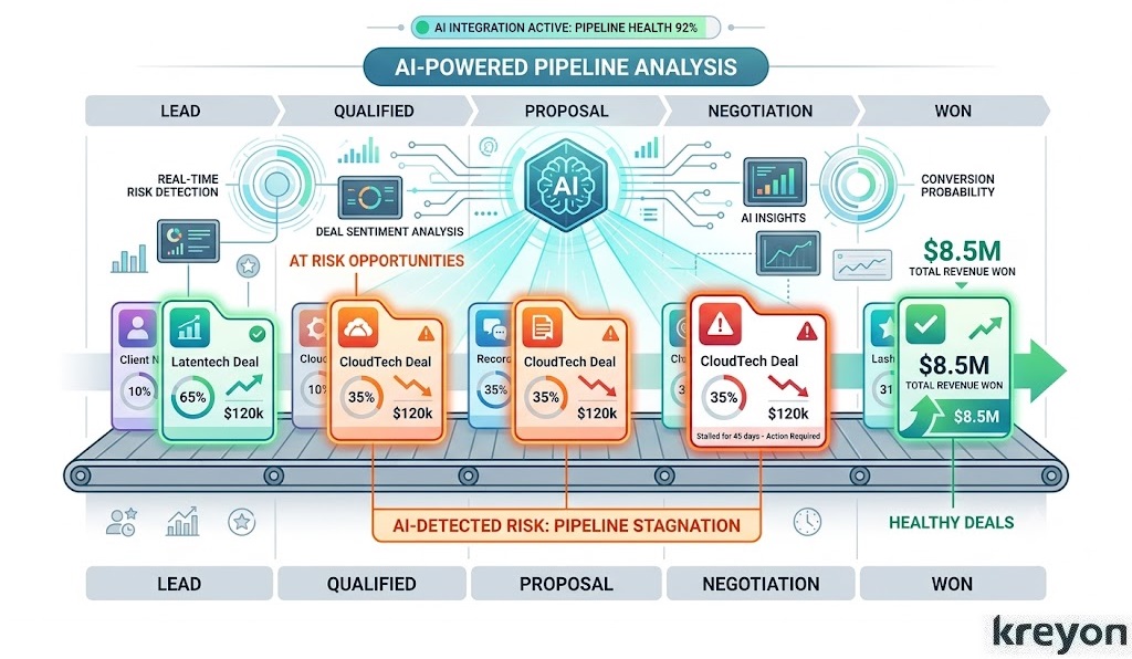
11. At-Risk Deals
This is where AI can make a dashboard genuinely useful.
A conventional dashboard tells you what happened.
An AI sales dashboard can identify which opportunities deserve attention now.
Potential warning signals include:
No recent customer activity
Excessive time in one stage
Repeated pushed close dates
Declining engagement
Missing decision-makers
Discount escalation
Unexpected changes in deal size
Negative sentiment in sales communications
These signals shouldn’t automatically be treated as truth. They are prompts for human investigation.
That distinction is important.
AI should help a CEO decide where to look, not pretend it can replace judgment.
McKinsey’s research on generative AI in B2B sales similarly highlights opportunities to use AI and analytics to improve resource allocation, forecasting and seller productivity.
12. Forecast Risk and “What Changed?”
The most valuable Monday-morning KPI may not be a KPI at all.
It is the answer to:
“What changed since last Monday?”
An intelligent sales dashboard should summarize:
Forecast increases and decreases
New major opportunities
Lost deals
Slipped deals
Pipeline gaps
Win-rate changes
Customer risks
Significant pricing changes
Unexpected sales-cycle movement
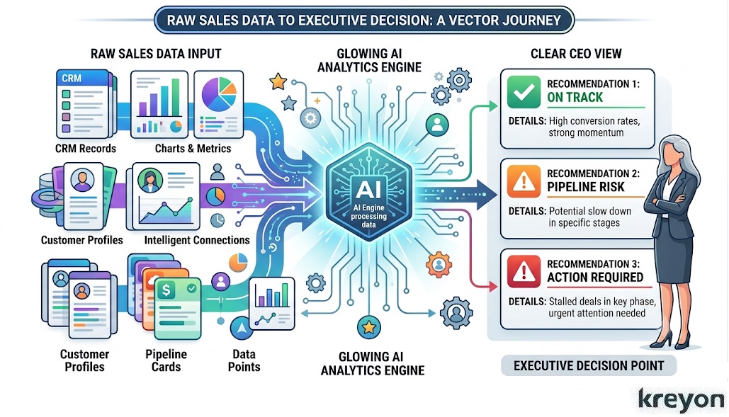
Instead of forcing the CEO to interpret 12 charts, AI can surface the five changes that actually matter.
That is the difference between reporting and decision support.
What an AI Sales Dashboard Should Actually Look Like
A CEO shouldn’t need a 47-tab BI system.
The Monday view can be remarkably compact:
| KPI | Current | Target | Trend | CEO Question |
|---|---|---|---|---|
| Revenue | $X | $Y | ↑/↓ | Are we on plan? |
| Forecast | $X | $Y | ↑/↓ | What will we close? |
| Pipeline | $X | $Y | ↑/↓ | Is coverage sufficient? |
| Win Rate | X% | Y% | ↑/↓ | Are we converting? |
| Deal Size | $X | $Y | ↑/↓ | Are customers getting bigger? |
| Sales Cycle | X days | Y days | ↑/↓ | Are deals slowing? |
| Pipeline Velocity | $X/day | $Y/day | ↑/↓ | Is pipeline moving? |
| New Opportunities | X | Y | ↑/↓ | Is future revenue healthy? |
| CAC | $X | $Y | ↑/↓ | Is acquisition efficient? |
| NRR | X% | Y% | ↑/↓ | Are customers expanding? |
| At-Risk Deals | X | — | ↑/↓ | Where should I intervene? |
| Forecast Risk | X% | — | ↑/↓ | What could derail the quarter? |
The exact KPIs should change with the business model. A SaaS company, enterprise-services company and transactional ecommerce business should not use identical dashboards.
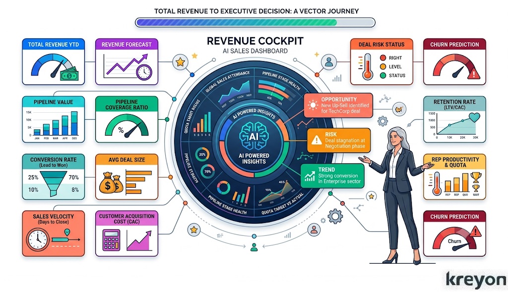
McKinsey describes this broader idea as a commercial-performance “cockpit”: a highly automated dashboard combining backward-looking sales performance with forward-looking pipeline indicators, ideally broken down by geography, business unit, account or sales team.
The CEO’s Monday Ritual
The best dashboard is not the one with the most data.
It’s the one that changes what leadership does.
A useful Monday review can follow four questions:
-
Are we on track?
Review revenue, target and forecast. -
Is the future healthy?
Review pipeline, coverage and new qualified opportunities. -
Where is the machine slowing down?
Review win rate, sales cycle and pipeline velocity. -
What requires intervention?
Review at-risk deals, forecast changes and customer risks.
That takes the dashboard out of the reporting department and puts it where it belongs: inside the operating rhythm of the company.
Why AI Changes the Dashboard Conversation
Traditional dashboards answer questions you already know to ask.
AI can help uncover questions you didn’t think to ask.
For example:
“Three enterprise opportunities worth $1.8 million have pushed their expected close date twice in the last 14 days. Two have had declining buyer engagement. Together they account for 28% of the quarter’s forecast.”
That is much more useful than a green pipeline chart.
But the strongest systems keep humans in the loop. AI recommendations should be traceable to underlying CRM data, clearly distinguish predictions from facts, and give sales leaders the ability to inspect the evidence.
The technology is advancing quickly. McKinsey’s 2026 research, based on its B2B Pulse Survey of nearly 4,000 buyers and sellers across 13 countries, describes agentic AI as increasingly relevant to commercial workflows and sales growth.
The implication for CEOs is straightforward: don’t add AI merely because your dashboard can display it. Add AI where it reduces the time between signal and decision.
Final Takeaway
An AI sales dashboard should not be another screen your leadership team dutifully opens every Monday and ignores by Tuesday.
It should answer three fundamental questions:
Where are we?
Where are we going?
What should we do about it?
The 12 KPIs above provide a practical starting point. Revenue and forecast tell you whether the business is on course. Pipeline, win rate and velocity explain the health of the sales engine. CAC, retention and expansion reveal whether growth is economically durable.
AI-powered risk detection can help leadership focus its attention where it matters most.
Kreyon Systems transforms raw pipeline data into real-time revenue clarity with predictive AI analytics. Empower executive decisions with automated, high-impact KPI visibility. For queries, please contact us.