Power BI Dashboard for Sales: Turning Raw Data into Revenue
Imagine walking into your Monday sales meeting without scrambling through spreadsheets, chasing CRM reports, or second-guessing the numbers.
Instead, every key metric, revenue, conversion rates, pipeline health, regional performance, and sales forecasts is displayed on one interactive screen, updated in real time. That’s exactly what a Power BI Dashboard for Sales delivers.
In the high-stakes theater of modern enterprise, hope is a terrible strategy. Yet, organizations routinely drown in data while starving for actual insight. This is where a well-architected BI dashboard for Sales shifts from a luxury IT project to an indispensable operational engine.
When built with a deep understanding of human behavior and strategic alignment, a sales dashboard does something profound: it translates the chaotic, fragmented story of your sales floor into a coherent narrative that drives decisive action.
Why the Standard CRM Fails the Strategic Leader
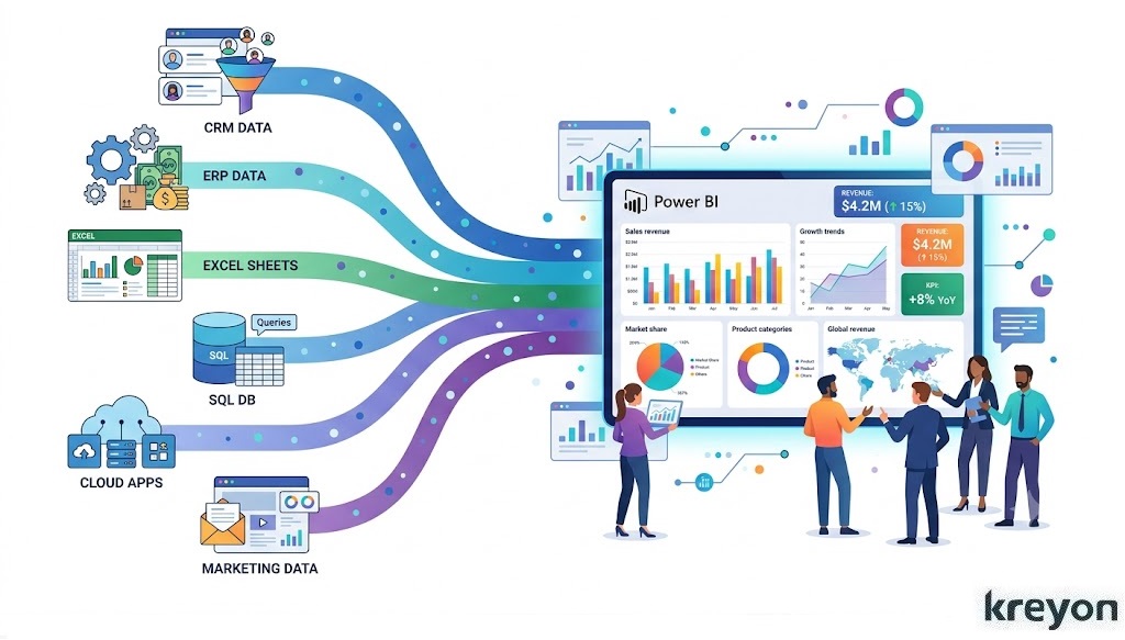
To understand why a dedicated Power BI Dashboard for Sales is essential, we must first confront a uncomfortable truth: your CRM is not built for strategic analysis.
Systems like Salesforce and HubSpot are brilliant operational ledgers. They excel at capturing transactional data—logging emails, moving deals through stages, and storing contact information. But when you ask a CRM to perform complex, cross-functional data synthesis, it begins to buckle.
[ERP (Finance)] ──┐
[CRM (Sales)]   ──┼─> [Power BI Engine] ──> Strategic Analytics &
[HRIS (Quota)]  ──┘                         Predictive Insights
A true sales intelligence ecosystem requires blending data from disparate silos. What happens when you want to look at pipeline velocity against historical marketing spend? Or compare individual quota attainment with regional supply chain constraints managed in an ERP?
Power BI bridges these massive operational chasms. It extracts data from your isolated repositories, cleanses the noise, and presents a single, immutable version of the truth. It moves your management team past the “Is this data accurate?” debate straight into “What are we doing about this?”
Designing a Power BI Dashboard for Sales with the End User in Mind

The graveyard of business intelligence is filled with beautiful, overly complex dashboards that nobody uses. Data engineers often fall into the trap of building for completeness rather than clarity, resulting in cognitive overload for the end user.
To design a high-adoption Power BI Dashboard for Sales, you must build for three distinct organizational personas:
1. The Executive View (The Macro Perspective)
The C-suite doesn’t need to know how many cold calls a representative made on Tuesday. They need to see macro trends. Your executive view should focus heavily on high-level financial health:
ARR (Annual Recurring Revenue), year-over-year growth, cost of acquisition (CAC) vs. lifetime value (LTV), and overall pipeline coverage.
Whether you’re managing a team of ten sales executives or overseeing a multinational sales operation, a well-designed Power BI dashboard can help answer critical questions in seconds:
Which products are driving the highest revenue?
Which sales representatives consistently exceed targets?
Where are deals getting stuck in the sales pipeline?
Which regions are underperforming?
What revenue can we realistically expect next quarter?
Instead of relying on intuition, sales leaders can make confident, data-backed decisions. Keep this clean, visual, and focused entirely on strategic trajectory.
2. The Sales Manager View (The Operational Engine)
Sales managers live in the messy middle. They need to see coaching opportunities and operational bottlenecks. Their view must highlight pipeline velocity, win/loss ratios by stage, rep-by-rep quota attainment, and deal slippage.
Understanding whether sales teams are meeting targets is essential for performance management.
Dashboards often display:
Target vs Actual Sales
Goal Completion Percentage
Monthly Progress
Team Rankings
Number of open opportunities
Pipeline value
Win probability
Average deal size
Pipeline by sales stage
A manager’s dashboard should instantly flag anomaly behaviors, like a major account sitting in the “Proposal Sent” stage for 45 days without an update.
3. The Account Executive View (The Tactical Playbook)
For the reps on the ground, a dashboard should act as a personal coach. It needs to show them exactly where to spend their time tomorrow morning to hit their commission goals.
Common conversion metrics include:
Lead to Opportunity
Opportunity to Proposal
Proposal to Closed Deal
Overall Sales Conversion Rate
Total Revenue
Gross Profit
Year-over-Year Growth
Revenue by Region
Top Performing Products
Sales Target Achievement
Monthly Sales Trends
Forecast vs Actual Revenue
Focus this view on active deal health, upcoming contract renewals, gap-to-quota metrics, and urgent task prioritization.
The Metrics That Actually Matter: Moving Beyond Vanity
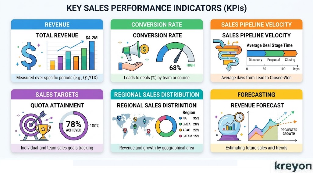
When deploying a Power BI Dashboard for Sales, the temptation is to track every variable imaginable because you can. Resist this.
Vanity metrics, like total emails sent or raw lead volume—often mask systemic rot in the sales funnel. Instead, anchor your dashboard around leading and lagging indicators that drive behavioral change.
| Metric Type | Key Performance Indicator (KPI) | Strategic Value |
| Lagging | Closed-Won Revenue vs. Target | Quantifies financial success and variance. |
| Leading | Pipeline Coverage Ratio | Determines if you have enough pipeline to hit future targets (typically 3x-4x). |
| Velocity | Sales Cycle Length | Measures the days it takes to move a lead from creation to closed-won. |
| Efficiency | Win Rate by Lead Source | Identifies which marketing and outbound channels yield the highest ROI. |
An effective sales dashboard should answer questions such as:
Are we on track to meet this month’s revenue target?
Which products contribute the highest revenue?
Which customers generate the most profit?
Which sales opportunities require immediate attention?
Where are deals slowing down in the pipeline?
How accurate are our sales forecasts?
When a dashboard answers these questions at a glance, it becomes a daily decision-making tool rather than a monthly reporting exercise.
You can build rolling averages and predictive trend lines that account for seasonal fluctuations, ensuring your forecasts are grounded in mathematical reality rather than sales-rep optimism.
Fostering a Culture of Data Accountability
Even the most technologically advanced Power BI Dashboard for Sales will fail if your organization lacks a culture of data accountability. Technology does not change behavior; leadership does.
To ensure your investment pays dividends, your data dashboard must become the central operational anchor of the business. If a deal isn’t accurately reflected in the dashboard, it doesn’t exist in the eyes of leadership.
┌─────────────────────────────────────────────────────────┐
│              The Accountability Loop                    │
├─────────────────────────────────────────────────────────┤
│ 1. Raw Data Input (Rep CRM Discipline)                  │
│    │                                                    │
│    ▼                                                    │
│ 2. Automated Synthesis (Power BI Dashboard)             │
│    │                                                    │
│    ▼                                                    │
│ 3. Strategic Intervention (Data-Backed Management)       │
└─────────────────────────────────────────────────────────┘
When data visibility is democratized across the sales floor, a fascinating psychological shift occurs. Peer-to-peer accountability naturally spikes. Gamification elements, such as live leaderboards driven by Power BI, can tap into the competitive drive inherent in high-performing sales professionals.
Simultaneously, it shifts the nature of manager-rep 1-on-1s. Instead of spending 45 minutes answering administrative status updates, managers can spend that time providing tactical coaching on specific, high-risk deals highlighted by the system.
Common Mistakes to Avoid When Building a Power BI Dashboard for Sales
Even the most powerful analytics platform can fall short if the dashboard isn’t designed with the end user in mind.
Over the years, many organizations have invested in business intelligence tools only to find that employees continue exporting data into Excel. The issue usually isn’t the technology, it’s the dashboard design.
Here are some of the most common pitfalls and how to avoid them.
1. Tracking Too Many KPIs
A sales dashboard should answer business questions, not display every metric available.
When users are faced with dozens of charts, gauges, and tables, they often struggle to identify what actually matters. Instead, focus on a concise set of KPIs that align with your business goals, such as:
- Revenue
- Pipeline Value
- Win Rate
- Average Deal Size
- Sales Growth
- Target Achievement
If additional metrics are needed, make them accessible through drill-down reports rather than crowding the main dashboard.
2. Ignoring Data Quality
A dashboard is only as reliable as the data behind it.
Duplicate customer records, inconsistent product names, or outdated CRM entries can distort reports and lead to poor decisions. Establishing data governance, validation rules, and regular audits helps ensure your Power BI dashboards remain trustworthy.
3. Designing for Reports Instead of Decisions
Many dashboards become digital versions of printed reports. They present information but don’t encourage action.
A high-performing Power BI Dashboard for Sales should immediately answer questions like:
- Which deals need attention today?
- Which regions are underperforming?
- Which products are driving growth?
- Where should sales managers focus this week?
When dashboards are built around decision-making rather than reporting, they become indispensable business tools.
4. Not Considering the Audience
Executives, sales managers, and account executives each need different levels of detail.
Creating role-specific dashboards ensures every stakeholder sees the insights most relevant to their responsibilities, improving adoption and usability.
The Business Impact of a Power BI Dashboard for Sales

A thoughtfully designed sales dashboard delivers benefits that extend far beyond reporting.
Faster Decision-Making
Instead of waiting for weekly or monthly reports, teams gain immediate access to live sales data. Managers can identify issues early and respond before they affect revenue.
Improved Forecast Accuracy
By combining historical performance with current pipeline data, Power BI enables more reliable sales forecasting. This helps businesses plan inventory, staffing, and budgets with greater confidence.
Better Sales Team Performance
Transparent performance metrics encourage accountability. Managers can identify coaching opportunities, recognize top performers, and align incentives with measurable outcomes.
Enhanced Customer Insights
When Power BI integrates with CRM systems such as Microsoft Dynamics 365, organizations gain a deeper understanding of customer behavior, buying patterns, and lifetime value. These insights support more personalized engagement and stronger customer relationships.
Greater Collaboration
With a shared, real-time view of sales performance, leadership, finance, marketing, and operations can work from the same data. This reduces conflicting reports and promotes more coordinated decision-making.
The Path Forward: Implementing Your Intelligence Engine
Transitioning your enterprise to a genuinely data-driven sales motion requires a deliberate, iterative approach.
-
Audit Your Data Infrastructure: Before writing a single line of code in Power BI, audit the cleanliness of your underlying data sources. Bad data in always equals bad insights out.
-
Start Small, Scale Fast: Do not attempt to build the ultimate, all-encompassing dashboard on day one. Launch a Minimum Viable Product (MVP) focused on pipeline health for a single business unit. Gather user feedback, optimize the interface, and expand organically.
-
Invest in Enablement: Ensure your leadership and field teams are deeply trained on how to interpret the visualizations.
The ultimate goal of a Power BI Dashboard for Sales isn’t merely to display what happened yesterday.
It is to illuminate the path forward, enabling your organization to anticipate market shifts, deploy resources with surgical precision, and predictably scale revenue. Stop guessing where your revenue will come from. Build the engine that tells you precisely where it is.
Get tailored BI dashboards for sales by Kreyon Systems to track KPIs, forecast accurately & scale your pipeline. If you have queries, please contact us.